This is part five of a series on ggplot2.
Today, we are going to spend some time on themes and legends in ggplot2. This is where we can add a lot of polish to our graphs.
Legends
The guides() function gives us some control over how legends appear. Let’s start with a graph which includes a single legend:
library(tidyverse)
library(gapminder)
library(ggrepel)

oddities <- gapminder %>%
filter(gdpPercap > 75000 & lifeExp < 70) %>%
group_by(country) %>%
summarize(maxLifeExp = max(lifeExp)) %>%
inner_join(gapminder, by = c("country" = "country", "maxLifeExp" = "lifeExp"))

ggplot(data = gapminder, mapping = aes(x = gdpPercap, y = lifeExp)) +
    geom_point(alpha = 0.5, mapping = aes(color = continent)) +
    scale_color_brewer(type = "qual", palette = "Dark2") +
    geom_smooth(method = "lm", se = FALSE) +
    scale_x_log10(label = scales::dollar) +
    labs(
        x = "GDP (PPP, normalized to 2005 USD)",
        y = "Mean Life Expectancy",
        title = "Wealth And Longevity",
        subtitle = "Charting the relationship between a country's prosperity and its residents' life expectancy.",
        caption = "Source:  Gapminder data set, 2010",
        color = "Continent"
    ) +
    annotate(
        geom = "text",
        x = 85000,
        y = 48.3,
        label = "High-GDP countries with\nunexpectedly low mean\nlife expectancy.",
        size = 3.5
    ) +
    annotate(
        geom = "rect",
        xmin = 75000,
        xmax = 130000,
        ymin = 53,
        ymax = 70,
        fill = "Red",
        alpha = 0.2
    ) +
    geom_text_repel(
        data = oddities,
        mapping = aes(x = gdpPercap, y = maxLifeExp, label = country),
        size = 2.3, segment.color = NA, nudge_x = 0
    )

By default, the legend is on the right-hand side and is named after the variable. That label is fine here, but often times, you’ll want something a bit nicer.
First up, let’s use the guides() function to fuss with the guide. Inside guides(), you can work with any individual legend on a plot. Our continent legend is based on the color of data points—we defined that up in geom_point()—so we want to modify the guide associated with color. To modify this, we use the guide_legend() function. The guide_legend() function lets us set details on the legend, like how many rows or columns, what the legend title should be, label ordering, and positioning.
In our case, I’m going to add a colon to our title. If I wanted to change the number of columns or number of rows used to display the legend, I could set ncol or nrow here, respectively. But this legend looks alright as a single column–making it two columns doesn’t make it look better.
I would next like to show the continent list at the bottom of the graph rather than on the right-hand side. To do this, we need to introduce the theme() function. The theme() function is jam-packed with parameters, but we’re going to start with legend.position:
ggplot(data = gapminder, mapping = aes(x = gdpPercap, y = lifeExp)) +
    geom_point(alpha = 0.5, mapping = aes(color = continent)) +
    scale_color_brewer(type = "qual", palette = "Dark2") +
    geom_smooth(method = "lm", se = FALSE) +
    scale_x_log10(label = scales::dollar) +
    labs(
        x = "GDP (PPP, normalized to 2005 USD)",
        y = "Mean Life Expectancy",
        title = "Wealth And Longevity",
        subtitle = "Charting the relationship between a country's prosperity and its residents' life expectancy.",
        caption = "Source:  Gapminder data set, 2010",
        color = "Continent"
    ) +
    annotate(
        geom = "text",
        x = 85000,
        y = 48.3,
        label = "High-GDP countries with\nunexpectedly low mean\nlife expectancy.",
        size = 3.5
    ) +
    annotate(
        geom = "rect",
        xmin = 75000,
        xmax = 130000,
        ymin = 53,
        ymax = 70,
        fill = "Red",
        alpha = 0.2
    ) +
    geom_text_repel(
        data = oddities,
        mapping = aes(x = gdpPercap, y = maxLifeExp, label = country),
        size = 2.3, segment.color = NA, nudge_x = 0
    ) +
    guides(color = guide_legend(title = "Continent:")) +
    theme(legend.position = "bottom")

There’s a lot more we can do with the theme() function around legends. We can set background, spacing, alignment, direction, and justification for the title, the keys, and the boxes. In this case, I’m going to leave well enough alone and move on to overall themes.
Themes
There are a few themes built into ggplot2: theme_grey() [the default], theme_bw(), theme_classic(), and theme_minimal(). Of these four built-in themes, my preference is for theme_minimal(), which is a minimalist approach to visualization. The background is white rather than grey, there aren’t any borders or boxes, and it really makes your data the star of the show.
As an important note, you must put the theme before any modifications you want to make. So in our case, theme_minimal() must go before my theme() function call; otherwise, theme_minimal() will override my choices and show the legend on the right-hand side.
ggplot(data = gapminder, mapping = aes(x = gdpPercap, y = lifeExp)) +
    geom_point(alpha = 0.5, mapping = aes(color = continent)) +
    scale_color_brewer(type = "qual", palette = "Dark2") +
    geom_smooth(method = "lm", se = FALSE) +
    scale_x_log10(label = scales::dollar) +
    labs(
        x = "GDP (PPP, normalized to 2005 USD)",
        y = "Mean Life Expectancy",
        title = "Wealth And Longevity",
        subtitle = "Charting the relationship between a country's prosperity and its residents' life expectancy.",
        caption = "Source:  Gapminder data set, 2010",
        color = "Continent"
    ) +
    annotate(
        geom = "text",
        x = 85000,
        y = 48.3,
        label = "High-GDP countries with\nunexpectedly low mean\nlife expectancy.",
        size = 3.5
    ) +
    annotate(
        geom = "rect",
        xmin = 75000,
        xmax = 130000,
        ymin = 53,
        ymax = 70,
        fill = "Red",
        alpha = 0.2
    ) +
    geom_text_repel(
        data = oddities,
        mapping = aes(x = gdpPercap, y = maxLifeExp, label = country),
        size = 2.3, segment.color = NA, nudge_x = 0
    ) +
    theme_minimal() +
    guides(color = guide_legend(title = "Continent:")) +
    theme(legend.position = "bottom")

The ggthemes library gives us a couple dozen more themes, as well as some color and shape scales. Let’s switch color palette and theme, using a colorblind-safe palette and the 538 theme.
ggplot(data = gapminder, mapping = aes(x = gdpPercap, y = lifeExp)) +
    geom_point(alpha = 0.5, mapping = aes(color = continent)) +
    ggthemes::scale_color_colorblind() +
    geom_smooth(method = "lm", se = FALSE) +
    scale_x_log10(label = scales::dollar) +
    labs(
        x = "GDP (PPP, normalized to 2005 USD)",
        y = "Mean Life Expectancy",
        title = "Wealth And Longevity",
        subtitle = "Charting the relationship between a country's prosperity and its residents' life expectancy.",
        caption = "Source:  Gapminder data set, 2010",
        color = "Continent"
    ) +
    annotate(
        geom = "text",
        x = 85000,
        y = 48.3,
        label = "High-GDP countries with\nunexpectedly low mean\nlife expectancy.",
        size = 3.5
    ) +
    annotate(
        geom = "rect",
        xmin = 75000,
        xmax = 130000,
        ymin = 53,
        ymax = 70,
        fill = "Red",
        alpha = 0.2
    ) +
    geom_text_repel(
        data = oddities,
        mapping = aes(x = gdpPercap, y = maxLifeExp, label = country),
        size = 2.3, segment.color = NA, nudge_x = 0
    ) +
    ggthemes::theme_fivethirtyeight() +
    guides(color = guide_legend(title = "Continent:")) +
    theme(legend.position = "bottom")

It’s pretty easy to swap out themes and scales, and there are some nice themes in here. Some of my favorites are theme_economist(), theme_wsj(), theme_fivethirtyeight(), and theme_few().
Custom Modifications
You are not limited to using defaults in your graphs. Let’s go back to the minimal theme but change the fonts a bit. I want to make the following changes:
- Use Gill Sans fonts instead of the default
- Increase the title font size a little bit
- Decrease the X axis font size a little bit
- Remove the Y axis; the subtitle makes it clear what the Y axis contains
Fonts? On Windows?
If you’re following along on a Windows box, you will inevitably hit one of my favorite errors: “font family not found in Windows font database”
It turns out that the way R on Windows works with fonts is a bit different than on MacOS or Linux. If you stick to the default fonts, you’re okay, but as soon as you want to start doing anything fancy, you get stuck in font purgatory.
There are a few ways to try to solve this problem. I’ve tried most of them with mixed success. Most of them involve loading the extrafont library. Then, import your fonts and load the Windows fonts. Note that font import takes a while—it took 5-10 minutes on my machines.
install.packages("extrafont")
library(extrafont)
font_import()
loadfonts(device="win") #load Windows-specific fonts
This is definitely a place where R on Linux/Mac is superior to R on Windows.
The Changes
With that sidebar out of the way, let’s look at our new graph:
ggplot(data = gapminder, mapping = aes(x = gdpPercap, y = lifeExp)) +
    geom_point(alpha = 0.5, mapping = aes(color = continent)) +
    scale_color_brewer(type = "qual", palette = "Dark2") +
    geom_smooth(method = "lm", se = FALSE, color = "#777777") +
    scale_x_log10(label = scales::dollar) +
    theme_minimal() +
    labs(
        x = "GDP (PPP, normalized to 2005 USD)",
        y = NULL,
        title = "Wealth And Longevity",
        subtitle = "Charting the relationship between a country's prosperity and its residents' life expectancy.",
        caption = "Source:  Gapminder data set, 2010",
        color = "Continent"
    ) +
    annotate(
        geom = "text",
        x = 85000,
        y = 48.3,
        label = "High-GDP countries with\nunexpectedly low mean\nlife expectancy.",
        size = 3.5,
        family = "Gill Sans MT"
    ) +
    annotate(
        geom = "rect",
        xmin = 75000,
        xmax = 130000,
        ymin = 53,
        ymax = 70,
        fill = "Red",
        alpha = 0.2
    ) +
    geom_text_repel(
        data = oddities,
        mapping = aes(x = gdpPercap, y = maxLifeExp, label = country),
        size = 3, segment.color = NA, nudge_x = 0, family = "Gill Sans MT"
    ) +
    guides(color = guide_legend(title = "Continent:")) +
    theme(
        legend.position = "bottom",
        text = element_text(family = "Gill Sans MT"),
        plot.title = element_text(size = 20),
        plot.subtitle = element_text(size = 12),
        plot.caption = element_text(size = 9),
        legend.title = element_text(size = 9),
        axis.title = element_text(size = 10)
    )

I made a few changes here. You can see that I added family = “Gill Sans MT” to several spots. This changes the font from a default sans-serif font to the Gill Sans MT library. This is a smaller sans-serif font, so I bumped up the size of the title and subtitle in the theme() function to set them off a bit relative to the X axis font size. I also changed the geom_smooth line color to gray, so that it’s a little easier to focus on the distribution of dots rather than the line itself.
At this point, we have a publication-quality graph. Well done!
Creating Another Publication-Worthy Graph
Let’s go back to the time series graph from before:
time_frame <- Sys.Date() - 0:31
df <- data.frame(
    date = time_frame,
    price = runif(32)
)
annotations <- data.frame(
    date = c(Sys.Date() - 24, Sys.Date() - 3),
    remark = c("Problem reported", "False alarm reported")
)

ggplot(df, aes(date, price)) +
    geom_line() +
    scale_x_date(date_breaks = "8 days", date_minor_breaks = "2 day") +
    geom_vline(xintercept = as.numeric(annotations$date), color = "Red", linetype = "dotdash") +
    geom_text(
        data = annotations,
        mapping = aes(x = date, y = 0, label = remark),
        color = "Red"
    )
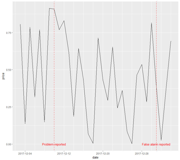
We can take what we know and turn this into a fully finished graph.
ggplot(df, aes(date, price)) +
    geom_line() +
    scale_x_date(date_breaks = "8 days", date_minor_breaks = "2 day") +
    geom_vline(xintercept = as.numeric(annotations$date), color = "Red", linetype = "dotdash") +
    geom_text_repel(
        data = annotations,
        mapping = aes(x = date, y = 0, label = remark),
        color = "Red",
        nudge_x = -2
    ) +
    theme_minimal() +
    labs(
        x = NULL,
        y = "Price",
        title = "Widget Price Changes",
        caption = "Source:  Vital Corporate Data Set"
    ) +
    theme(
        text = element_text(family = "Gill Sans MT"),
        plot.title = element_text(size = 20),
        plot.caption = element_text(size = 9),
        axis.title = element_text(size = 14),
        axis.text = element_text(size = 12)
    )

There are a few changes here. I used the same theme and title scheme as before, so these two graphs could fit together as part of the same report. I switched from geom_text to ggrepel‘s geom_text_repel and used the nudge_x attribute over so that the text did not overlap with the vertical line. Just making a few simple changes is enough to turn a graph from half-finished to something with a lot more polish.
