This is part four of a series on ggplot2.
Last time around, we looked at how to use scales and coordinates to clean up charts. Today, we’re going to dig into labels and annotations, two vital parts of creating aesthetically pleasing graphs.
Labels
In ggplot2, we use the labs function to modify labels. By labels, I’m including labeling the X and Y axis, creating subtitles and titles, creating captions, and the header for a legend.
Let’s start with an image that we’ve already seen before:
if(!require(tidyverse)) {
  install.packages("tidyverse", repos = "http://cran.us.r-project.org")
  library(tidyverse)
}

if(!require(gapminder)) {
  install.packages("gapminder", repos = "http://cran.us.r-project.org")
  library(gapminder)
}

ggplot(data = gapminder, mapping = aes(x = log(gdpPercap), y = lifeExp)) +
  geom_point(alpha = 0.5, mapping = aes(color = continent)) +
  scale_color_brewer(type = "qual", palette = "Dark2") +
  geom_smooth(method = "lm", se = FALSE)

Aside from our scale problem (that we’ll fix…again), I don’t like having “lifeExp” and “log(gdpPercap)” be the X and Y axis labels. I guess the term “continent” is okay but I’d prefer it be capitalized. We should also create a title so people know what this visual represents, and I’d like to reference that the source is the gapminder data set. We can do pretty much all of this in one extra function call.
ggplot(data = gapminder, mapping = aes(x = gdpPercap, y = lifeExp)) +
  geom_point(alpha = 0.5, mapping = aes(color = continent)) +
  scale_color_brewer(type = "qual", palette = "Dark2") +
  geom_smooth(method = "lm", se = FALSE) +
  scale_x_log10(label = scales::dollar) +
  labs(
    x = "GDP (PPP, normalized to 2005 USD)",
    y = "Mean Life Expectancy",
    title = "Wealth And Longevity",
    subtitle = "Charting the relationship between a country's prosperity and its residents' life expectancy.",
    caption = "Source:  Gapminder data set, 2010",
    color = "Continent"
  )

And just like that, we have a nicer-looking visual.
So what else can we do? If you set x = NULL or y = NULL, then the X or Y axis, respectively, will no longer have a label. This makes sense when laying out a bar or column chart, like our chart of data by continent:
ggplot(data = lifeExp_by_continent_1952, mapping = aes(x = reorder(continent, avg_lifeExp), y = avg_lifeExp)) +
  geom_col() +
  labs(
    x = NULL,
    y = "Mean Life Expectancy"
  )

It’s clear that we’re showing continents, so I do not need to tell you that. I also changed the Y axis label to be something better than “avg_lifeExp.”
There isn’t much else that you can do with the label itself. There’s plenty you can do with themes, and we’ll cover that in detail in an upcoming post. But at least we now have the ability to create nicer-looking labels. Now let’s look at annotations.
Annotations
Annotations are useful for marking out important comments in your visual. For example, going back to our wealth and longevity chart, there was a group of Asian countries with extremely high GDP but relatively low average life expectancy. I’d like to call out that section of the visual and will use an annotation to do so. To do this, I use the annotate() function. In this case, I’m going to create a text annotation as well as a rectangle annotation so you can see exactly the points I mean.
ggplot(data = gapminder, mapping = aes(x = gdpPercap, y = lifeExp)) +
  geom_point(alpha = 0.5, mapping = aes(color = continent)) +
  scale_color_brewer(type = "qual", palette = "Dark2") +
  geom_smooth(method = "lm", se = FALSE) +
  scale_x_log10(label = scales::dollar) +
  labs(
    x = "GDP (PPP, normalized to 2005 USD)",
    y = "Mean Life Expectancy",
    title = "Wealth And Longevity",
    subtitle = "Charting the relationship between a country's prosperity and its residents' life expectancy.",
    caption = "Source:  Gapminder data set, 2010",
    color = "Continent"
  ) +
  annotate(
    geom = "text",
    x = 85000,
    y = 48.3,
    label = "High-GDP countries with\nunexpectedly low mean\nlife expectancy.",
    size = 3.5
  ) +
  annotate(
    geom = "rect",
    xmin = 75000,
    xmax = 130000,
    ymin = 53,
    ymax = 70,
    alpha = 0.2
  )

We’ve added about 15 lines of code (because I’m keeping things nice and readable for the annotations) but it’s still just two function calls. Also, notice that the text geom uses x and y parameters, whereas the rectangle uses xmin+xmax and ymin+ymax. Finally, I want to point out that the x and y values are at the same scale as on our graph—it’s not pixels over or anything weird like that.
More Geoms: Text, HLine, VLine
I skipped four geometric objects early on: text, rect, hline, and vline. The reason I skipped them is because they fit better here, with labeling and annotating data. We can use the text geom to write text onto our visual, rect will let us draw a rectangle, and the hline and vline geoms will draw horizontal and vertical lines, respectively. In this post, I’m going to look at a variant on text, as well as horizontal and vertical lines. I’ll skip the geom_rect, but it behaves similarly to other geoms that we’ve seen so far.
So let’s start with the text geom. What if I want to label each country in that high-GDP range above? I could go look it up manually and annotate each point, but that’s a brittle solution which really only works on this chart and this data (sort of like my annotation…). For something a little more robust, let’s use geom_text. Specifically, I’m going to use geom_text_repel(), which is a function that comes with ggrepel. The ggrepel package is an addon for ggplot2 which figures out ways to add text onto a graph without overlap. Visuals with overlapping text look amateur, and we’re trying to avoid looking more amateur than we already do…
Specifically, I want to show the name of each country in the red box, but I only want to name each country once, and I want to put the label somewhere near the point with the highest life expectancy within that block. To do that, I’m going to use geom_text_repel but I also need to build up a data set with the distinct countries in that range.
if(!require(ggrepel)) {
  install.packages("ggrepel", repos = "http://cran.us.r-project.org")
  library(ggrepel)
}

oddities <- gapminder %>%
  filter(gdpPercap > 75000 & lifeExp < 70) %>%
  group_by(country) %>%
  summarize(maxLifeExp = max(lifeExp)) %>%
  inner_join(gapminder, by = c("country" = "country", "maxLifeExp" = "lifeExp"))

ggplot(data = gapminder, mapping = aes(x = gdpPercap, y = lifeExp)) +
  geom_point(alpha = 0.5, mapping = aes(color = continent)) +
  scale_color_brewer(type = "qual", palette = "Dark2") +
  geom_smooth(method = "lm", se = FALSE) +
  scale_x_log10(label = scales::dollar) +
  labs(
    x = "GDP (PPP, normalized to 2005 USD)",
    y = "Mean Life Expectancy",
    title = "Wealth And Longevity",
    subtitle = "Charting the relationship between a country's prosperity and its residents' life expectancy.",
    caption = "Source:  Gapminder data set, 2010",
    color = "Continent"
  ) +
  annotate(
    geom = "text",
    x = 85000,
    y = 48.3,
    label = "High-GDP countries with\nunexpectedly low mean\nlife expectancy.",
    size = 3.5
  ) +
  annotate(
    geom = "rect",
    xmin = 75000,
    xmax = 130000,
    ymin = 53,
    ymax = 70,
    fill = "Red",
    alpha = 0.2
  ) +
  geom_text_repel(
    data = oddities,
    mapping = aes(x = gdpPercap, y = maxLifeExp, label = country),
    size = 2.3, segment.color = NA, nudge_x = 0
  )
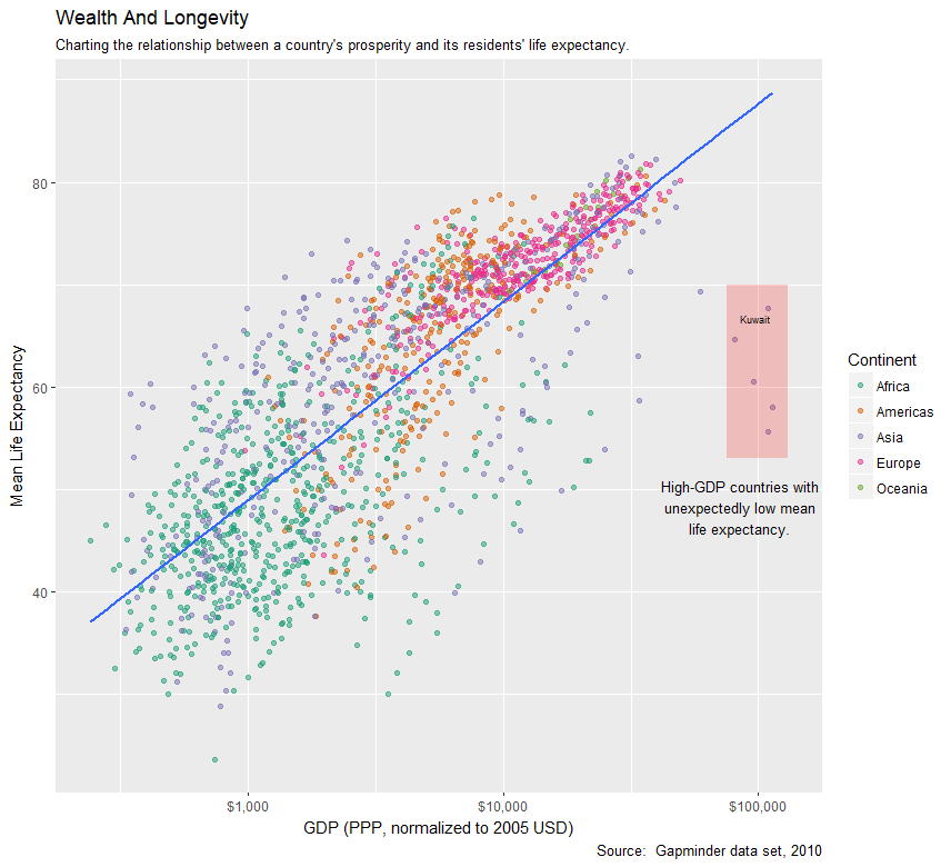
We’re getting more and more code, but our visual is also a bit more complex. The first bit, after installing/loading ggrepel, is to build up the data frame of odd countries. It turns out that there’s just one odd country in this set: Kuwait, which had extremely high GDP from the 1950s through 1970s, but low life expectancy. Kuwait is a special case in this data set for a couple of reasons: their population was extremely low in the 1950s and there was limited ownership of the sole interesting resource in the country. The first factor means that the mean GDP (which is our per capita calculation) is through the roof; the second factor means that most people were not direct recipients of that benefit.
Regardless of the explanation, we now have annotations and labels for those extreme outliers.
We can also draw vertical and horizontal lines on the graph using the geom_vline and geom_line functions, respectively.
ggplot(data = gapminder, mapping = aes(x = gdpPercap, y = lifeExp)) +
  geom_point(alpha = 0.5, mapping = aes(color = continent)) +
  scale_color_brewer(type = "qual", palette = "Dark2") +
  geom_smooth(method = "lm", se = FALSE) +
  scale_x_log10(label = scales::dollar) +
  labs(
    x = "GDP (PPP, normalized to 2005 USD)",
    y = "Mean Life Expectancy",
    title = "Wealth And Longevity",
    subtitle = "Charting the relationship between a country's prosperity and its residents' life expectancy.",
    caption = "Source:  Gapminder data set, 2010",
    color = "Continent"
  ) +
  annotate(
    geom = "text",
    x = 85000,
    y = 48.3,
    label = "High-GDP countries with\nunexpectedly low mean\nlife expectancy.",
    size = 3.5
  ) +
  annotate(
    geom = "rect",
    xmin = 75000,
    xmax = 130000,
    ymin = 53,
    ymax = 70,
    fill = "Red",
    alpha = 0.2
  ) +
  geom_text_repel(
    data = oddities,
    mapping = aes(x = gdpPercap, y = maxLifeExp, label = country),
    size = 2.3, segment.color = NA, nudge_x = 0
  ) +
  geom_vline(xintercept = 35000, color = "red", linetype = "dotdash") +
  geom_hline(yintercept = 75, color = "brown", linetype = "twodash")

In this case, I decided to show off a few features of hline and vline, filling in the color and linetype parameters. Those are not required and have sensible defaults of black and solid, respectively. You can also make the lines thicker by setting the size parameter to something greater than 1, but this is already garish enough. Horizontal and vertical lines can be useful, particularly in time series data. For example, let’s go back to the datetime example we had in a previous post. Suppose that we have a set of data but also a separate data frame with days where something interesting happened. We can annotate those interesting things on our plot pretty easily:
time_frame <- Sys.Date() - 0:31
df <- data.frame(
  date = time_frame,
  price = runif(32)
)
annotations <- data.frame(
  date = c(Sys.Date() - 24, Sys.Date() - 3),
  remark = c("Problem reported", "False alarm reported")
)

ggplot(df, aes(date, price)) +
  geom_line() +
  scale_x_date(date_breaks = "8 days", date_minor_breaks = "2 day") +
  geom_vline(xintercept = as.numeric(annotations$date), color = "Red", linetype = "dotdash") +
  geom_text(
    data = annotations,
    mapping = aes(x = date, y = 0, label = remark),
    color = "Red"
  )

In this case, we had two separate incidents occur, one a problem and one a false alarm. We plotted a vertical line at the appropriate date and also wrote out the remark text. Note that to map the date, I needed to call the as.numeric function to transform the date into a number. That’s a little weird but understandable when you figure that you’re trying to plot on a Cartesian space and that means real numbers rather than dates.
Conclusion
In today’s post, we looked at using labels and annotations to spruce up visuals. We saw how to create a visual with proper labels, a title, and even a caption with our data source. We also learned how to draw text on a plot, annotate sections of a plot, and draw horizontal and vertical lines.
In the next post, we will look at how to view different subsets of chart data using facets. Stay tuned!

Fantastic article, thanks a lot!